This post is the first in a series of posts about my experience building and designing Summit. This post focuses on just one view within the application; the current summit view.
The idea for Summit came nearly 4 years ago as far as I can tell. I’ve hunted around for scraps of paper, digital notes, code snippets to see if I can come up with an exact date but I’ve been unable to. And it has been fits and starts for several years.
When Kyle Ruane and I started on the idea we first thought the UI would be a bit more game-like. I envisioned a 3D model of the current mountain you were hiking that would progress the person up the summit in first-person towards each goal. This was altogether too much work, and far too difficult given my unfamiliarity with the platform. Kyle’s suggestion – again, many years ago – was to use a low poly look. He would craft a low poly representation of the summit and we could allow the user to move around in it, perhaps even spin it around, zoom in-and-out, etc.
I pulled that thread for a very short time before giving up. Remember, we started toying with the idea of Summit before Swift was released. So I was trying to draw this UI with Obj-C. Something I’m even more terrible at than Swift.
Here is what one attempt at drawing progress lines using Obj-C looked like back 4 years ago or so. I took this screenshot in June 2014 and was already labeling it "historical junk" in my files.
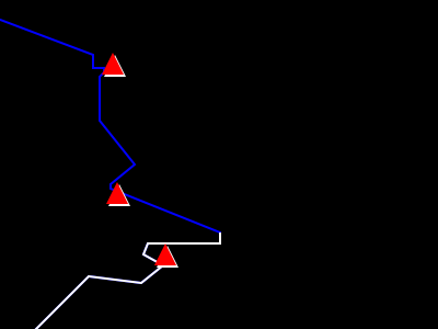
The red triangles were goals to meet, the blue line was your path, and the white line was your progress so far. My goal was to overlay this on top of the low poly art that Kyle drew. This was inspired by maps like this. (copied here for archival purposes)
This worked but was not that easy to pull of, introduced more complexity than we needed, and so we quickly shelved the idea until we got more familiar with the platform.
In tandem I began constructing a simple web UI to start cataloging steps from a phone. This was purely to get used to writing code that would track user’s steps, show stats, work on our step algorithm (the code that determines how far up Mount Everest a single step walking in a downtown city parking lot gets you), etc.
It went this way for a few years. I would open up a code editor and begin working on the pieces of Summit; the progress UI, the algorithm, the code to read from a user’s step count or HealthKit or Apple Watch.
In June 2017, when I picked up this project on my own to take on since Kyle had moved away, I decided I needed a simpler approach to the UI. In part because Kyle is the design genius but also in part because I wanted to get as quickly to shipping an app as I possibly could. I prefer to iterate on ideas with user feedback than to work on something in a silo for years. I wanted a way to show the summit, or some visual from the summit, but yet also show one’s progress. And I also still needed multiple goals per summit.
Here are a few drawings from this summer.
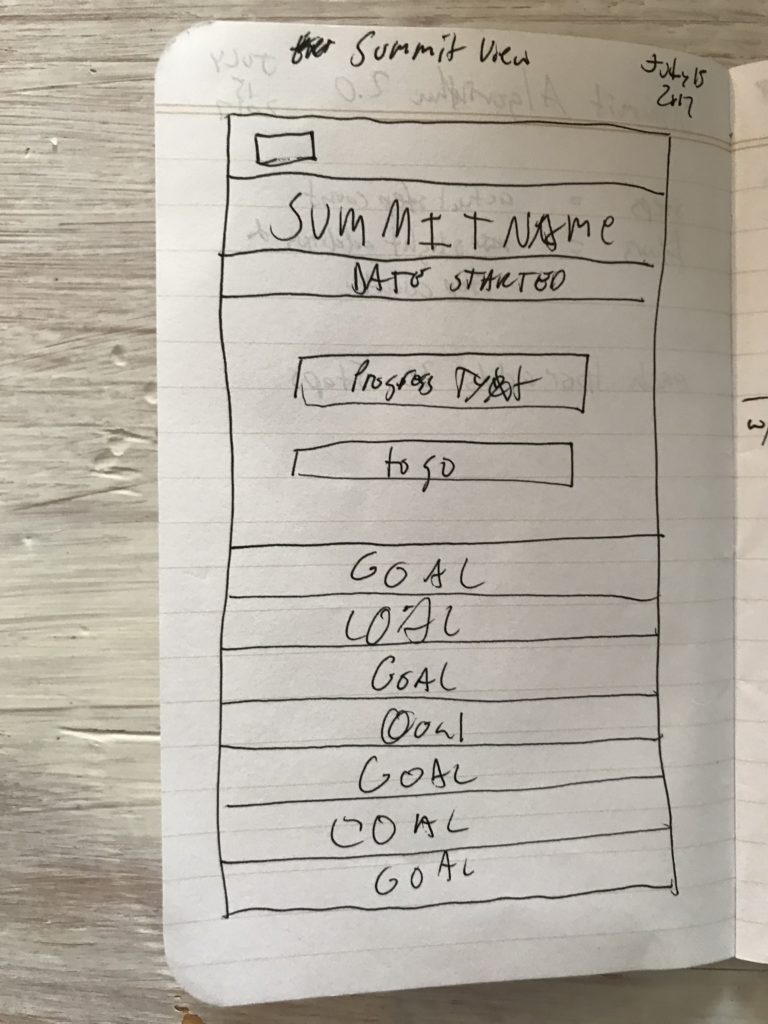
See, I’m not an artist. Admittedly, though, this wasn’t an attempt to draw anything beautiful but rather to get a general idea for all of the views I needed to pull off the layout. I needed some labels, some buttons, navigation, etc.
The long goal buttons was really "a punt" on my part. I gave up trying to get Xcode’s Storyboard feature to properly align a changing number of goal buttons (since each summit has a different number of goals) in a way that worked with each device size. It was very frustrating. So I began to go down this path of having them just be full-width, flat buttons.
But then I ran into Brian Voong on YouTube. In most of his video tutorials he suggests forgoing the Storyboard feature and using code to create the UI. Though I didn’t want to lose the progress I had made, I’m so glad that I took his advice. Writing UI directly in Swift is far, far easier (for me) and seemingly more powerful than using Storyboards.
This revelation allowed me to go back to a drawing I did a month earlier. This one:
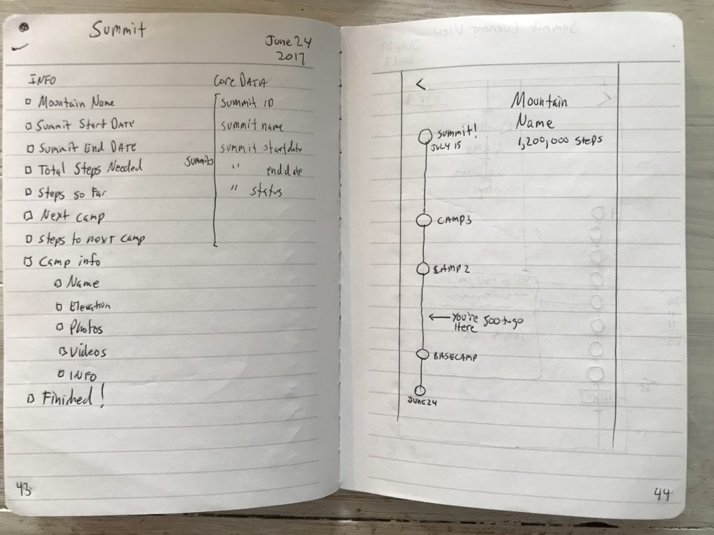
On the left, the elements needed, on the right, a rough sketch of a much more minimal and airy design of the current summit view. The goal buttons have varying distances between them relative to how far apart they are in real life (I’m still working on getting this right in the app).
Using Swift I was able to make this happen much easier than Storyboards.
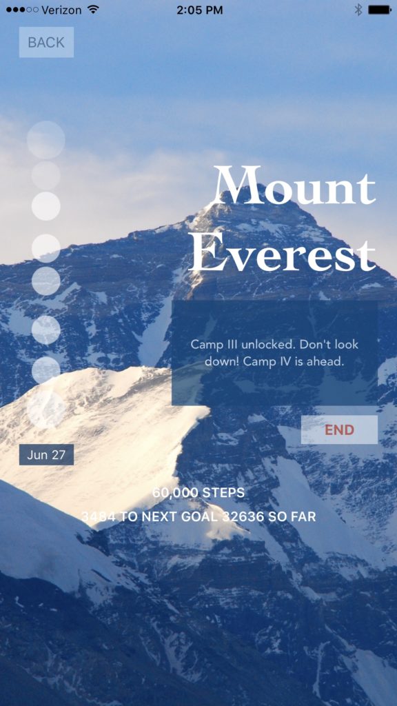
The above is one of the very first swings at this view. It had all of the elements I wanted. And I’ve been iterating on this specific design ever since. I wish I had the hundreds of iterations saved but I don’t.
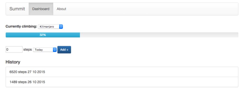
Here is what the most recent iteration looks like with goal buttons that are easier to determine your progress and other tweaks to make the UI more consistent.
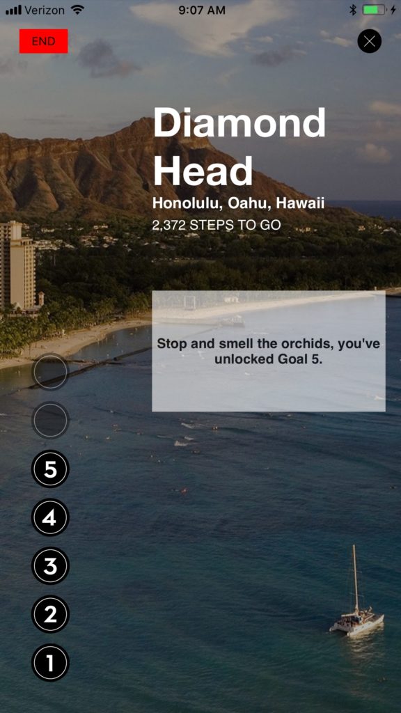
This is the design for this view I’ve settled with for now. I have plans to iterate on this current design for some time before, perhaps, taking a whole new swing at it. Perhaps my skills will grow to the point that I feel confident going back to Kyle’s low poly idea. But, I’m pleased with how it has come along so far.