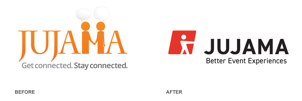
This project was not part of my Design Challenge. However, I thought I’d catalog this project here as I was the primary designer working on it, with help from Jujama’s designer Lindsey Jamieson.
Jujama is a nearly 10-year-old business (and my current employer) with global clients and a sophisticated product that services top-tier customers. The overall goal of the rebranding was to bring forward some element from the old logo – in this case, the “handshake” – and add energy, a more dynamic color pallet, and have the logo and mark be far more versatile than the old one.
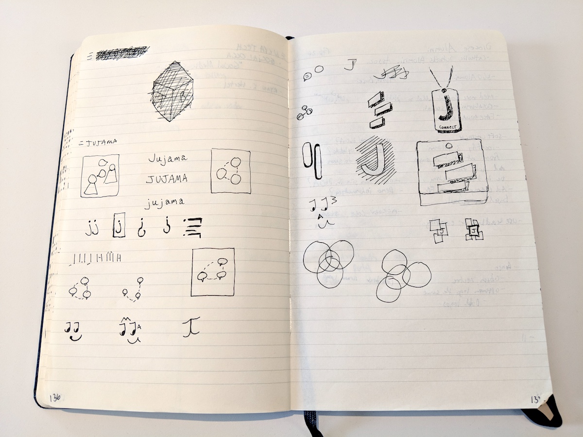
I started by sketching all sorts of ideas. Since Jujama offers a product to event management companies I used event-related iconography like lanyards, chat bubbles, audiences. I also tried several iterations using a recognizable J letterform but ultimately moved away from that concept.

Once I was in Illustrator I went wild on a few of these ideas – trying my best to find their edges. A few of them I spent multiple days with, trying to see if any of them had longevity. Here are a few of those.

Then, one day, while working with Lindsey on pulling forward the handshake concept I deleted one of the people in the handshake. And, there it was. Our new mark. It took several more weeks of tweaking the paths, the square, the edges, and settling on a type before we ended up with the above result.
Thanks also goes to Kyle Ruane, who I sent a version of this to, that provided some really key feedback as he always does.
This was a really fun project and I can’t wait to see how Jujama’s brand saturates this industry over the next few years.
